
How to Choose the Right Colour Scheme for Your Kitchen Design: Expert Tips
Walking into a kitchen sets the tone for the entire home. Whether you arrive in the morning looking for that first cup of coffee, or you’re welcoming guests on a Saturday night, the kitchen is where daily routines and special occasions often unfold. One element with the power to lift a space from the ordinary to the truly memorable is the paint colour scheme. Some kitchens feel bright, calm, and inviting, while others spark energy – and earthy tones can do much of the work behind these sensations.
Selecting a color palette for your kitchen isn’t about following passing trends. It’s about curating an environment that speaks to your personality, enhances the room’s function, and stays beautiful for years. If you’re planning a kitchen refresh or a full redesign, taking time with your colour choices pays off.
Let’s pinpoint what actually matters, assess the options, and offer thoughtful direction to help you select the right palette for your next kitchen project.
The Importance of Colour in Kitchen Design
Colour isn’t merely about aesthetics. Our perception of a space can change entirely depending on the tones we select. It affects:
-Mood and atmosphere
-Lighting and visual spaciousness
-Perceptions of cleanliness and order
-Resale value and buyer appeal
A strategically chosen palette can anchor your kitchen, making it a welcoming gathering point or a productive culinary workspace.
At Awesome Kitchens, every design begins by listening closely to what our clients love—and dislike—about colours. Decades in design have shown us just how personal these choices are, and how powerfully a harmonious palette improves daily life.
Key Considerations Before Starting
Every kitchen and household is unique. Before browsing the paint samples or cabinet finishes, let’s look at six essential considerations:
1. Natural Light: How much sunlight does your kitchen receive throughout the day? A north-facing room may need warmth, while a sun-drenched space can benefit from cooler tones.
2. Kitchen Size: Lighter shades create a sense of space in small rooms; dark hues can make large kitchens feel cosier.
3. Existing Fixtures: Worktops, splashbacks, flooring, and kitchen appliances all play a role. Unless you’re replacing everything, be mindful of how new colours interact with what’s staying.
4. Purpose: Is your kitchen a family hub, an entertainer’s paradise, or a chef’s atelier? Each vibe calls for a different palette.
5. Style Direction: Modern, classic, rustic, or eclectic—the overall style, whether a modern kitchen or another flavor, guides your colour family.
6. Personal Taste: Trends ebb and flow. Your satisfaction has to last. Trust your instincts.
Decoding the Colour Families
Navigating the universe of colour can be overwhelming. Narrowing options to colour families helps establish a direction:
| Colour Family | Feels Like | Works Well With | Common Pairings |
| Whites & Creams | Airy, clean, timeless | Every style | Oak, brass, terracotta |
| Greys | Elegant, neutral | Modern, industrial | Black, marble, timber |
| Blues & Greens | Calming, fresh | Coastal, country | White, rattan, stone |
| Deep Hues | Dramatic, moody | Large or high-ceiling | Metallics, gloss, glass |
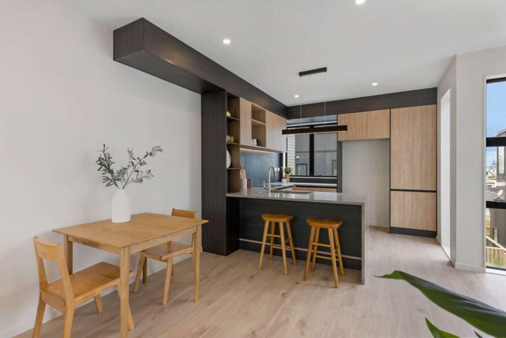
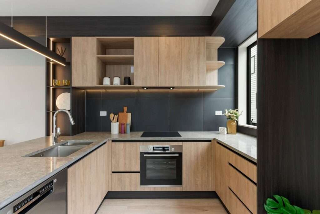
| Earthy Colours | Warm, inviting | Natural, rustic | Matte finishes, black |
| Pastels | Playful, charming | Vintage, soft modern | White, soft wood tones |
Some combinations have timeless appeal, like navy with pale wood in the kitchen, or soft grey paired with white marble. Others, like blush pink with brass or forest green with charcoal, signal confident modernity.
Trends in Kitchen Colour
While your preference reigns supreme, current trends can spark inspiration:
–Matte finishes in dark blues, greens, and blacks create striking contrast with timber and light benchtops.
–Scandinavian color palettes favour whites and pale wood for an effortless, sunlit, bright look.
-Earthy tones like olive, clay, and ochre revitalise minimalist spaces with natural warmth.
–Colourful cabinetry interiors (think mustard or teal) make opening a door or drawer unexpectedly delightful.
–Statement splashbacks featuring teal, emerald, or graphic monochrome tiles become artistic focal points.
Classic whites, greys, and neutrals continue their popularity in the kitchen, providing a backdrop that can be personalised with decorative pieces and fresh flowers.
How to Build Your Palette
The secret to a kitchen that stands the test of time is restraint. Choosing two to three primary colors keeps the space cohesive and sophisticated. This typically looks like:
–Main colour: Cabinets or walls, which take up the largest area
–Accent colour: Splashback, island, or shelves for contrast or pop
–Understated base: Bench surfaces or floors, usually in natural materials
A sample workflow may include:
1. Start with your main cabinet paint colour.
2. Pair it with a complementary wall and splashback shade.
3. Select bench and flooring finishes that ground the scheme.
4. Layer in metallic hardware, lighting, and small kitchen décor for extra character.
The Magic of Neutrals
Neutrals are often underestimated. They aren’t just “safe” but create a timeless foundation, giving flexibility to update the space with new chairs, art, or even a quirky toaster. A crisp palette of white, grey, and beige can highlight beautiful stone, timber, and the features of a modern kitchen, enhancing light movement throughout the day.
Neutrals work especially well in New Zealand homes, where light quality shifts so much between summer and winter. Subtle undertones—warm or cool—let you tailor the feeling from cosy to energetic.
Bold Choices: Making Colour Work for You
Going bold rewards those who are confident. Charcoal, navy, emerald, and deep maroon can inject real sophistication or drama. To avoid visual overload, stick to one dominant dark shade and balance it with lighter, reflective finishes.
Ways to integrate strong colours in the kitchen include:
-Using a feature wall
-Selecting deep-hued lower cabinets with lighter uppers
-Adding a colourful splashback or statement rangehood
Lighting plays a big part in making the kitchen and these choices feel welcoming rather than oppressive, while the right paint colors can amplify this effect. Integrated LED strips, pendant fixtures, and reflective materials keep even the deepest colours lively.
The Role of Texture and Finish
Colour isn’t just about paint swatches; the right combination of colors can transform a kitchen or any space entirely. Texture adds depth and interest even to a simple color palette in the kitchen, while a bright finish creates either vibrancy or subtlety.
Consider mixing:
– Matt and gloss cabinets
– Smooth and textured splashbacks
– Timber panelling for warmth
– Brushed versus polished metals
These subtleties create visual movement, making your modern kitchen feel carefully crafted.
Harmonising with the Wider Home
In open-plan houses, your kitchen scheme should flow seamlessly into other living areas. Linking earthy tones, materials, or accents across adjacent rooms prevents abrupt shifts and fosters a unified atmosphere.
Repeating a colour—on a kitchen island and a living room accessory, for example—brings cohesion. Stunning timber flooring running through kitchen and lounge helps too.
Practical Tips from the Experts
Over years of creating Auckland’s most admired kitchens, Awesome Kitchens’ designers have seen which approaches always lead to success. Our top recommendations:
– Always view colour samples in your actual kitchen under varying light conditions, not just in-store.
– Sample several finishes—don’t judge from a tiny paint chip or photograph.
– Don’t ignore shades you instinctively love, even if you think they “shouldn’t” work. Vision, plus expert guidance, often unlocks stunning combinations.
– Remember that painted cabinets can be resprayed in future, offering flexibility to refresh your palette down the track.
– If working with existing elements (floor, oven, tiles), let them guide your decisions rather than fight against them.
Common Mistakes and How to Dodge Them
Selecting a kitchen palette can feel daunting, and a few common traps often trip up renovators:
– Overdecorating: Too many hues and finishes can create a busy, restless space.
– Ignoring undertones: Even neutral whites can clash if one’s too warm and another’s too cool. Always compare options closely.
–Chasing trends without thought to context: What looks stunning in a magazine may not translate well to all New Zealand homes.
– Neglecting natural and artificial light: Good design adapts to the qualities of its situation and season.
Pausing at each step and getting honest feedback makes a huge difference.
Bringing Everything Together
A kitchen colour scheme isn’t just a matter of taste or trend. It’s a reflection of your lifestyle, your family’s rhythms, and the heart of your home. At Awesome Kitchens, our team recognises the power of personal preference but pairs it with technical know-how to deliver spaces that leave a lasting impression. When every detail—from cabinetry to splashback and hardware to lighting—works in harmony, your kitchen becomes a space that inspires, welcomes, and functions beautifully for daily life and entertaining alike. Each careful decision brings you closer to a home that truly feels like yours.